— Creative Direction, Art Direction & Graphic Design
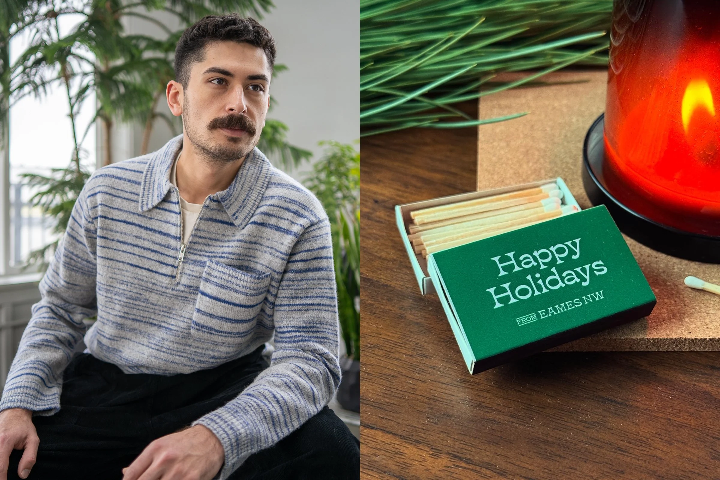
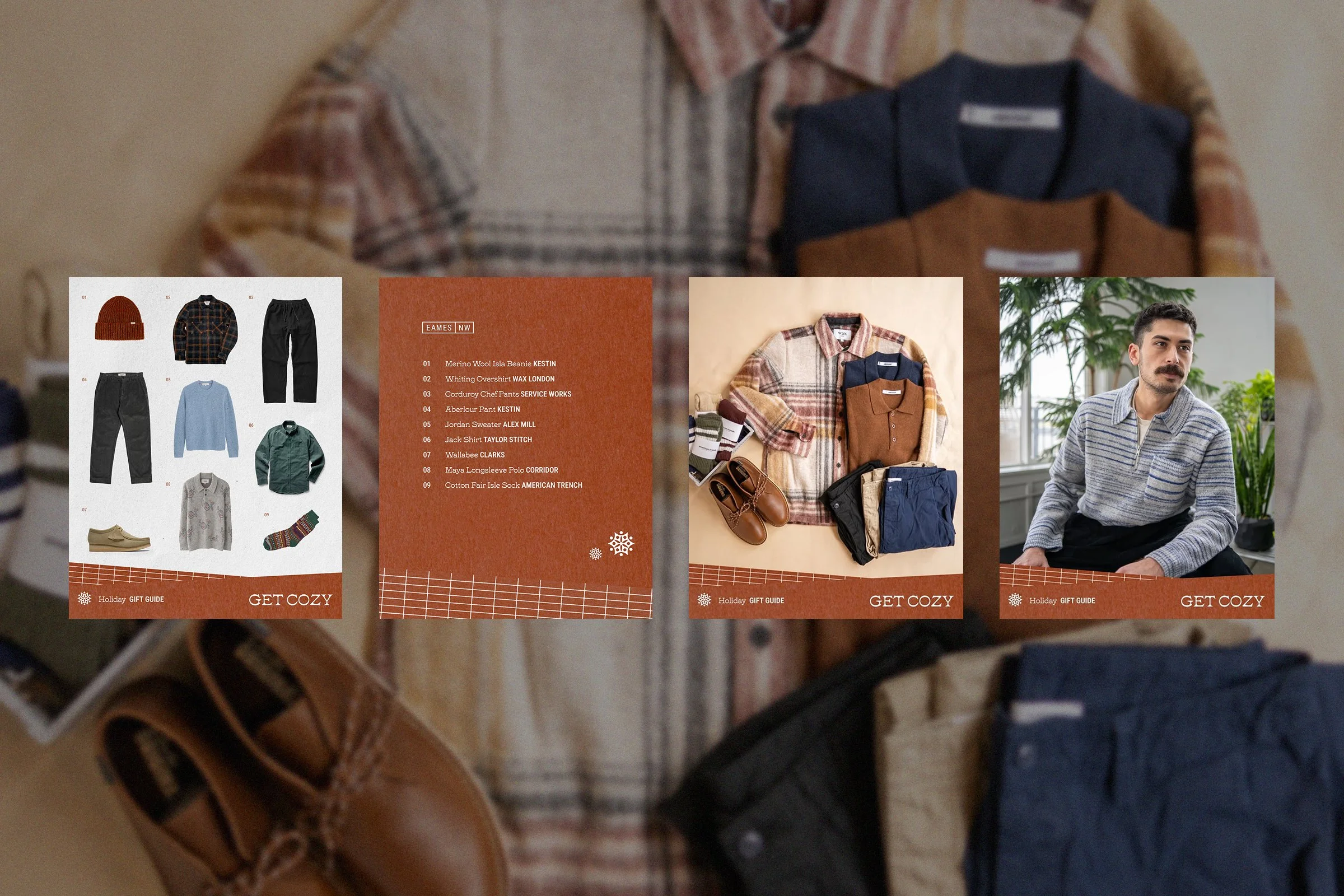
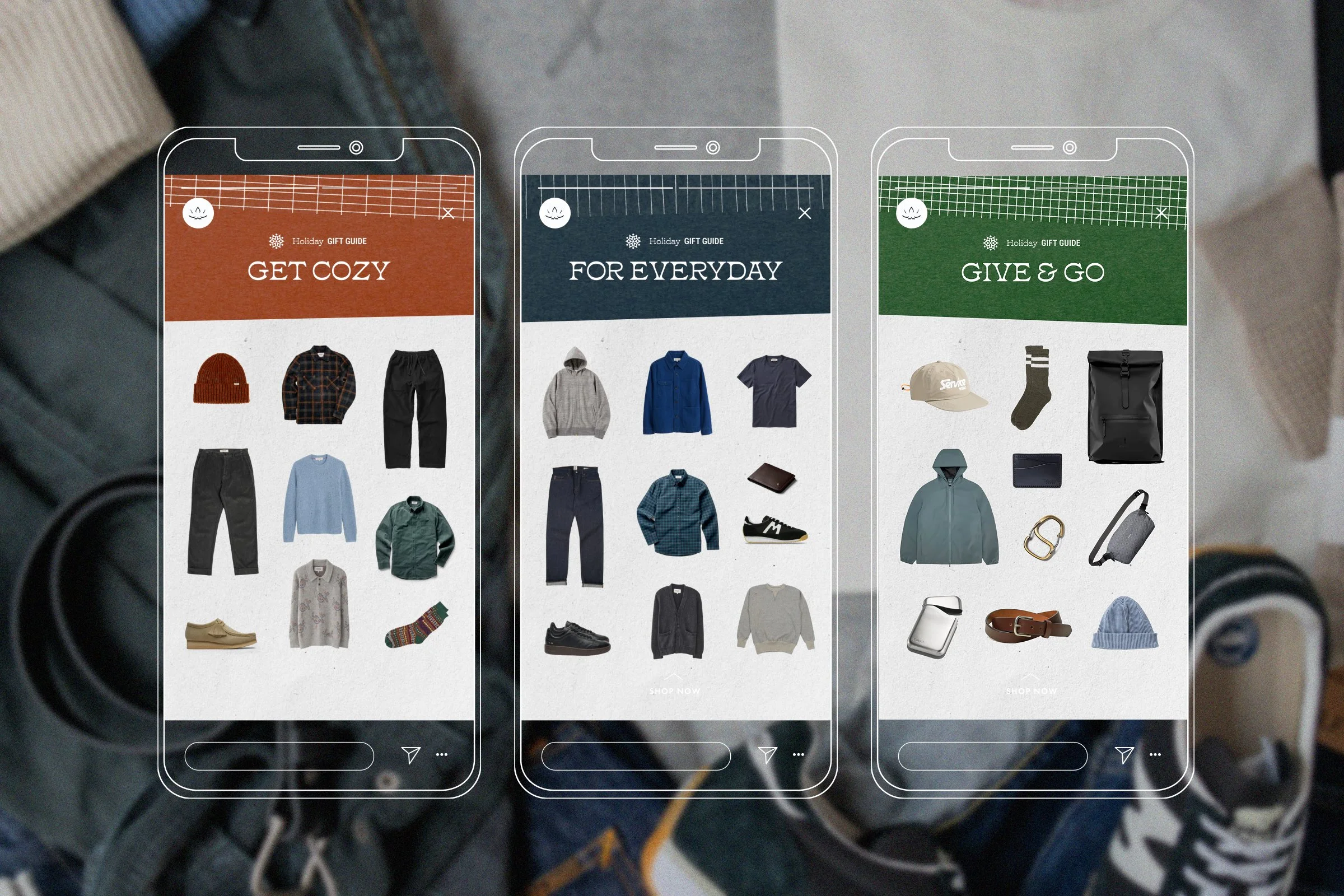
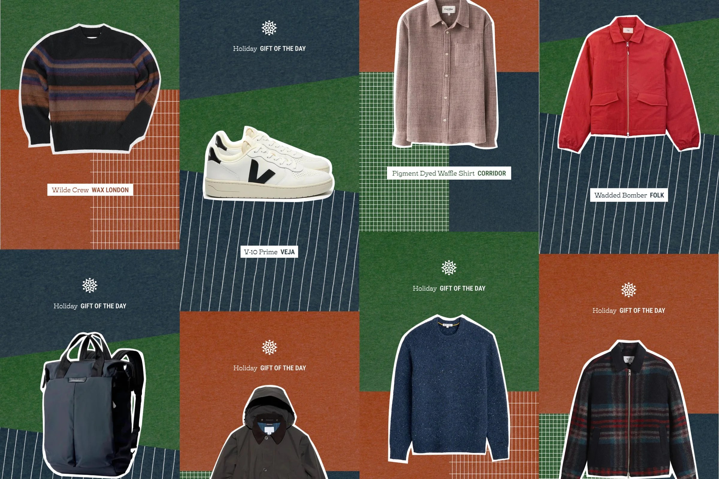
For Seattle-based menswear boutique, EamesNW, I directed a holiday gift guide campaign. I took a clean yet textural and playful approach for the art direction that complemented the brand’s minimalist aesthetic. I designed a toolkit of assets that included brand logos, type, hand-drawn textures and a bank of assets for social and digital marketing.
— Graphic Design
For Beyond Yoga’s social media team, I designed a graphics system for posting Instagram stories that direct to their online journal. The two-tone colors offer an eye-catching and playful individuality for each article. The rounded corners gives an editorial feel that complements their soft yet buoyant aesthetic.
— Art Direction, Curation, Graphic Design
For O.N.S’s Resident Artist program, I worked with New York based photographer René Fragoso in curating an in-store photo exhibition entitled New York Cityscapes & Artifacts. We collaborated on a booklet together where I consulted on the typography and graphic design. I art directed all the marketing and print materials that went along with the artist’s opening event.
— Editorial Design
"When Time Slowed Down" is a digital publication for Quadriga Management that featured work from their photographers while in quarantine. Along with laying out the type and photography, I also copy edited the introduction and came up with the title.
Branding
I designed a logo as well as a set of icons for Cisco Home. The elements were used across various channels for the company such as web and store sigange.
— Branding & Illustration
In collaboration with Savvy Studio, I worked on the branding for The Maidstone Hotel in East Hampton, NY. I designed the logo system and stationary. In addition, I made illustrations for the menus for the restaurant and cafe.
— Art Direction, Film Direction & Screenplay Writing
O.N.S Clothing is a New York based brand that produces quality menswear for modern living. As the art director, I created a campaign entitled “Now Arriving” for the Fall 2019 collection which was inspired by airports and travel. The brand narrative is centered around the experiences of the Urban Transplant so I wrote with a seasonal story focused on the excitement and hesitations of moving to a new city. Along with directing two photoshoots, a short film and NY Fashion week presentation, I designed a custom typeface inspired by tarmac lettering that was applied across multiple marketing channels. For the campaign, I designed a printed lookbook, social ads, title cards, a presentation evite, set vinyl graphics, in-store displays and street posters.
— Web Design
Originally a simple blog-scroll format, one of the main challenges for redesigning Tidal Magazine’s website was to feature online-exclusive content while also presenting content from the printed magazine. I came up with the solution to have separate landing pages but mix the content on the homepage to give an overall view of the publication.
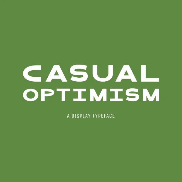
— Typeface Design
“Casual Optimism” means that you look like you’re having a good day without being overly excited about it. I wanted a typeface to capture that feeling. With wide widths and rounded forms, I designed this sans serif typeface to feel simple and friendly—contemporary but not too experimental.
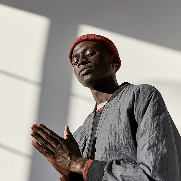
— Art Direction
O.N.S FW19 is a dialog on aviation, altitude, and functionality. The collection is further inspired by international airport terminals, aerial views of city grids, bold tarmac markings, and utilitarian uniforms.
Photographer: Alex Caesar
Stylist: Mitchell Belk
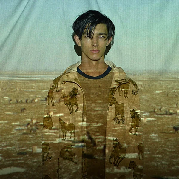
— Art Direction, Digital
For the O.N.S Fall/Winter 2018 season, I wanted a campaign that felt textural and dynamic. Drawing from the wintry desert inspiration, I decided to layer environmental landscapes with editorial shots that further emphasized the visual and tactile textures of the collection. Through the use of video projections, I was able to add a bit of movement as well as a bit more depth.
Photographer: Justin Bridges
Videographer: Derek Siyarngnork
Stylist: Jermaine Daley
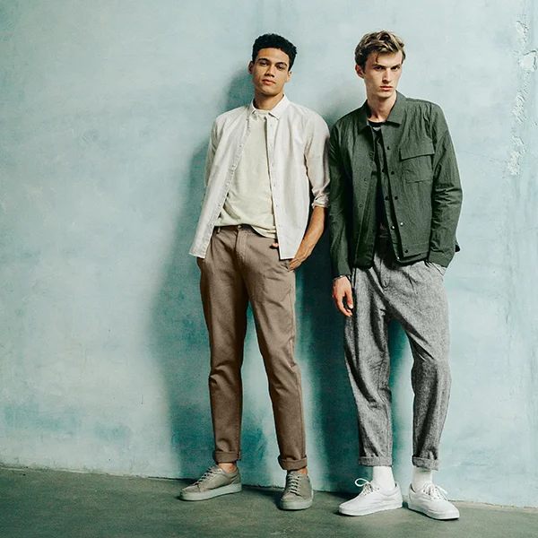
— Art Direction, Print
The O.N.S SS19 collection is inspired by Roberto Burle Marx’s graphic landscape designs and Oscar Niemeyer’s brutalist architecture. This season was also the introduction of the O.N.S Grey Label - a slightly more elevated line inspired by travel and movement.
Photographer: René Fragoso
Stylist: Herin Choi
— Art & Illustration
For my third Cool Cool NYC art show entitled “Studies”, I showcased explorations in graphic minimalism and ideas on how we physically acknowledge art. The “Singles Gestures” series plays around with the idea of using only single continuous strokes and is a lesson in control and letting go. My “Art of Experience” series illustrates how people look at art in a public setting and show that they are outwardly ‘acknowledging’ and ‘considering’ the piece.
— Type Design
Tamarama is a monolinear, sans serif typeface inspired by Sydney’s cultural blend of people and nature. The unmodulated lines give it a clean simplicity, while the crude angularity adds a more rugged quality. The rounded ends create a friendliness reminiscent of the sunny disposition of Sydneysiders. Named after a small beachside suburb, Tamarama is also a nod to Australia’s surf culture.
— Typeface Design
"Built" is a display typeface inspired by the idea of having to save space when living in a city apartment. I imaged a typeface that had visual dimension and could perhaps be regarded as a piece of furniture when large printed on a poster. It was designed from a set of hypothetical materials that you could assemble together if they were real. Character set includes: basic letters, number forms and general punctuation.
— Typeface Design & Photography
“Young Barca” is a project inspired by the young people I met while living in Barcelona. During my stay, I decided to work on a book where I interviewed and photographed young people on the street and asked them about their experiences living in Spain. For the book, I designed a typeface that felt fresh but also a bit subversive.