— Textile Art, Installation, Set Design
As an art director working in the fashion space, I’ve thought about how I could make a positive influence on the issue of textile waste. Starting from home, I deconstructed my old clothes and started to sew quilted pieces together with the fabric. Continuing to perfect my sewing skills, I began to think about other material sources. With my connection to ONS Clothing, I came across an assortment of damaged indigo tshirts that I happily took off their hands. The pockets on the shirts inspired this idea of incorporating pockets - visible and hidden - into the tapestries. For Earth Week at the ONS Flagship store, I sewed a 3’x9’ backdrop installation using the upcycled indigo fabrics and placed plant clippings into the pockets to show its additional function. This led to me working with FabScrap in Brooklyn, NY in sourcing more upcycled fabrics to use as backdrops for photoshoots and displays.
The Coolture art show held in the ONS resident artists space of their Nolita store featured tapestries that I created using a mix of fabric from my personal clothing, ONS dead stock and Fabscrap textiles. I hoped to show what can be done with the resources around us.
— Paper Sculptures, Drawings
As a main discipline, Studio CoolCool explores graphic forms through the interplay of 2D and 3D processes. Especially in the digital realm, the experiences between flat surfaces and spaces morph and blend with each other through technologies like augmented reality and immersive environments. I’m inspired by these shifts in perception and the expectations of depth and dimension. The Flatten Series plays with paper as a medium which can be manipulated to give and remove form and how added treatments can alter the perception of its form.
Learn more about the process here.
— Wood Sculptures, Drawings
As a main discipline, Studio CoolCool explores graphic forms through the interplay of 2D and 3D processes. The Knit Series pulls inspiration from textile design’s visual approach and how it can be applied to a more rigid material like wood off-cuts.
Learn more about process here
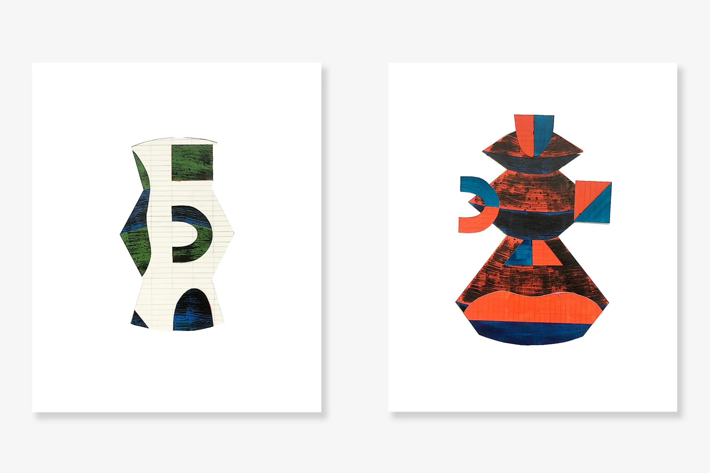
— Drawings, Collage, Sketching
What began as a way to reduce my art waste, I’ve incorporated collaging into my art and design practice as a method to push my work forward and open up to new, unexpected concepts. I take past works (drawings, paintings, sketches) and mix them into collages with new compositions and combinations of color and texture. Not only for art, I’ve applied this method as well to my design journals in which I mix references I find in the world with sketches from past projects in the hopes of finding new approaches to ideas. In a time of hybridity and codification, it’s important to open up the process and allow for the unexpected to break you out of your singular ways of thinking.
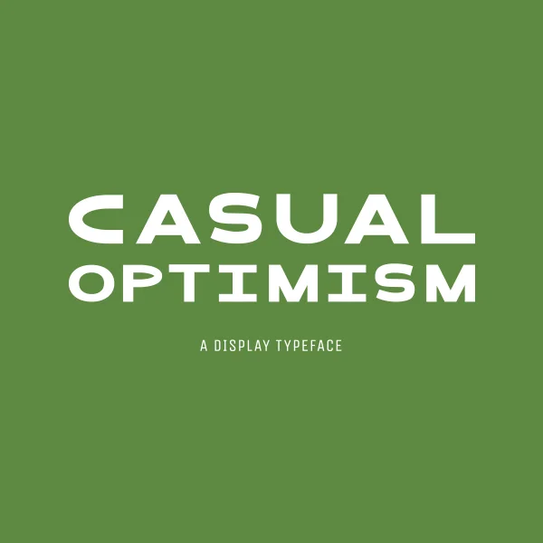
— Typeface Design
“Casual Optimism” means that you look like you’re having a good day without being overly excited about it. I wanted a typeface to capture that feeling. With wide widths and rounded forms, I designed this sans serif typeface to feel simple and friendly—contemporary but not too experimental.
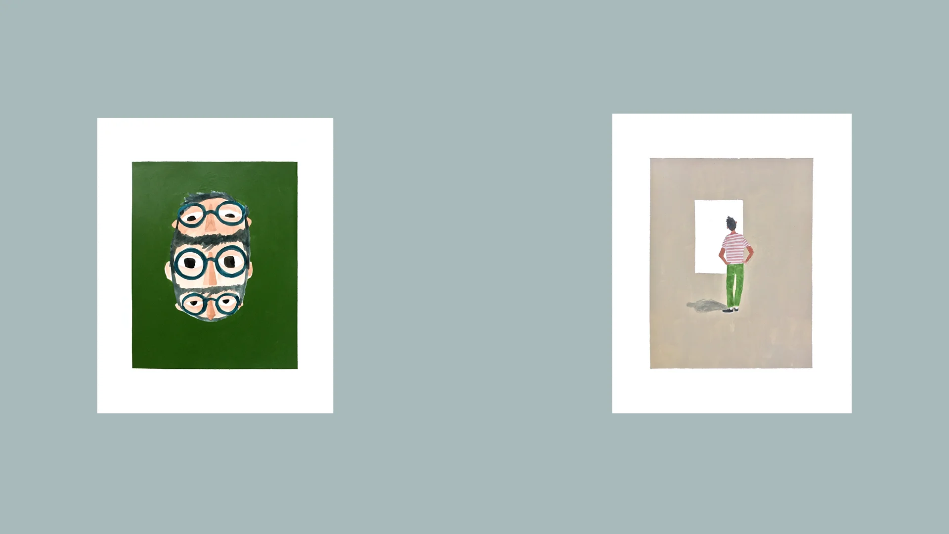
— Art & Illustration
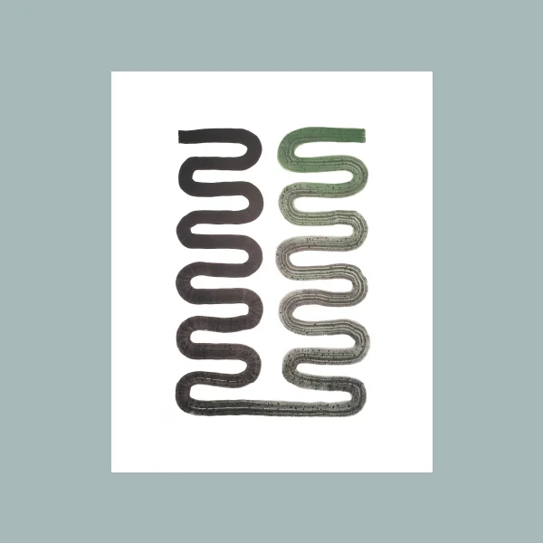
For my third Cool Cool NYC art show entitled “Studies”, I showcased explorations in graphic minimalism and ideas on how we physically acknowledge art. The “Singles Gestures” series plays around with the idea of using only single continuous strokes and is a lesson in control and letting go. My “Art of Experience” series illustrates how people look at art in a public setting and show that they are outwardly ‘acknowledging’ and ‘considering’ the piece.
— Typeface Design
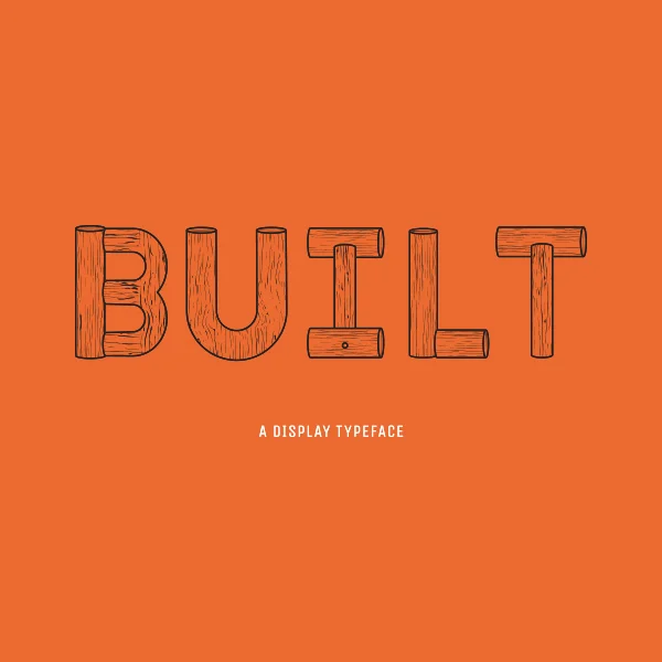
"Built" is a display typeface inspired by the idea of having to save space when living in a city apartment. I imaged a typeface that had visual dimension and could perhaps be regarded as a piece of furniture when large printed on a poster. It was designed from a set of hypothetical materials that you could assemble together if they were real. Character set includes: basic letters, number forms and general punctuation.
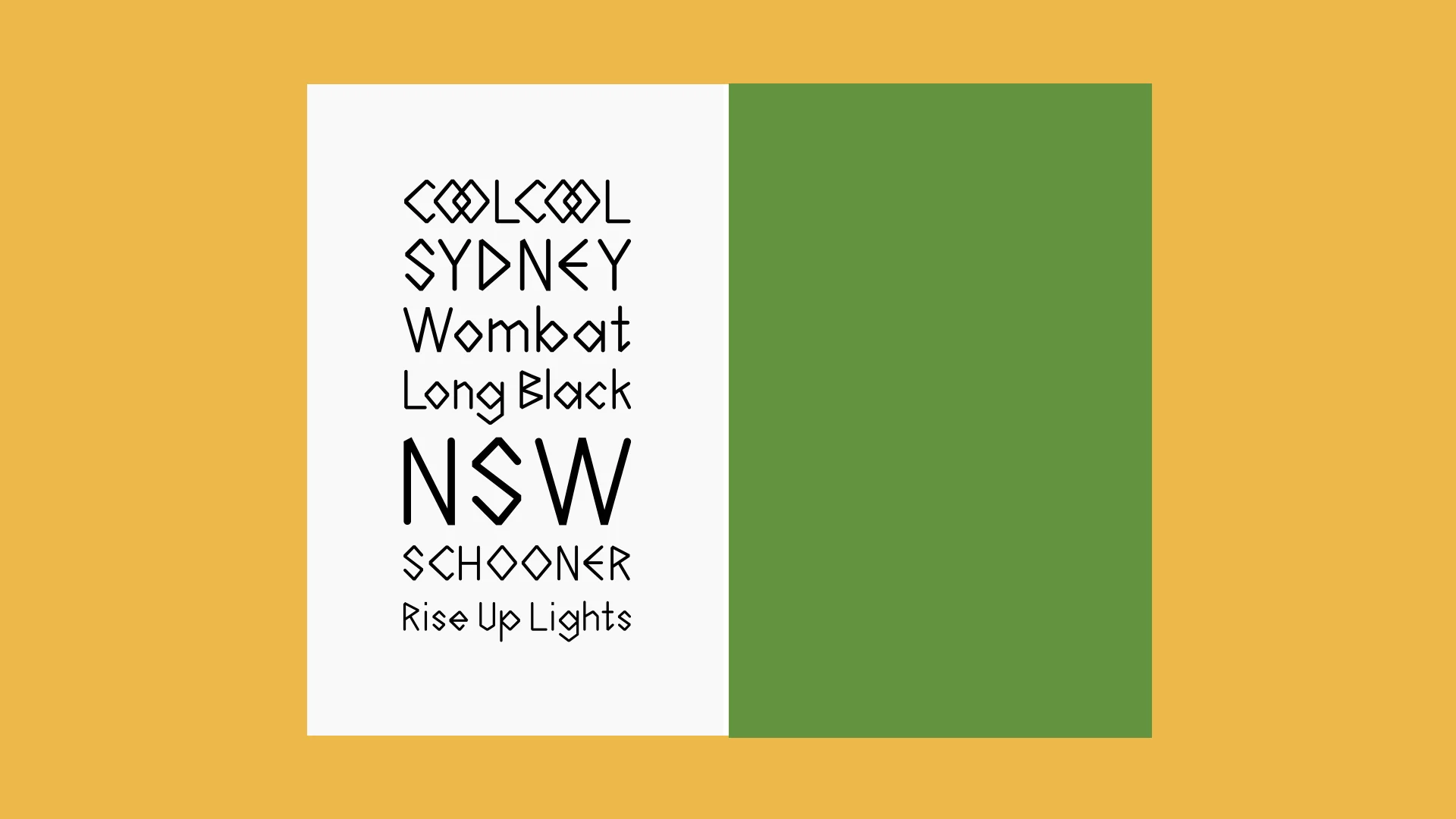
— Type Design
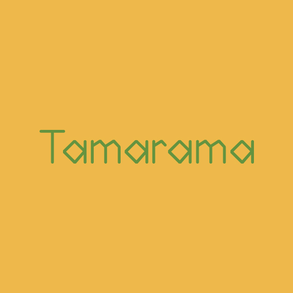
Tamarama is a monolinear, sans serif typeface inspired by Sydney’s cultural blend of people and nature. The unmodulated lines give it a clean simplicity, while the crude angularity adds a more rugged quality. The rounded ends create a friendliness reminiscent of the sunny disposition of Sydneysiders. Named after a small beachside suburb, Tamarama is also a nod to Australia’s surf culture.
— Typeface Design & Photography
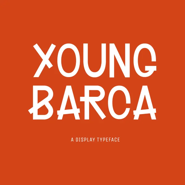
“Young Barca” is a project inspired by the young people I met while living in Barcelona. During my stay, I decided to work on a book where I interviewed and photographed young people on the street and asked them about their experiences living in Spain. For the book, I designed a typeface that felt fresh but also a bit subversive.